Conflict with wp job manager ?
Hello,
I’m just about to use finally AnsPress but I just have a little issue.
I use Wp-Job Manager to have some of listings features, but when I activate the AnsPress plugin my listing in the admin panel are compressed (see attachment file).
I don’t understand how this plugin can interact with this thing.
So, I ask here for help 🙂
Sorry for the blurred effect on the image, but we are currently in production mode and are trying a lot of plugin to have what we want so as long as we have issue we cannot choose and show an URL.
Thank you for your support and, really great plugin !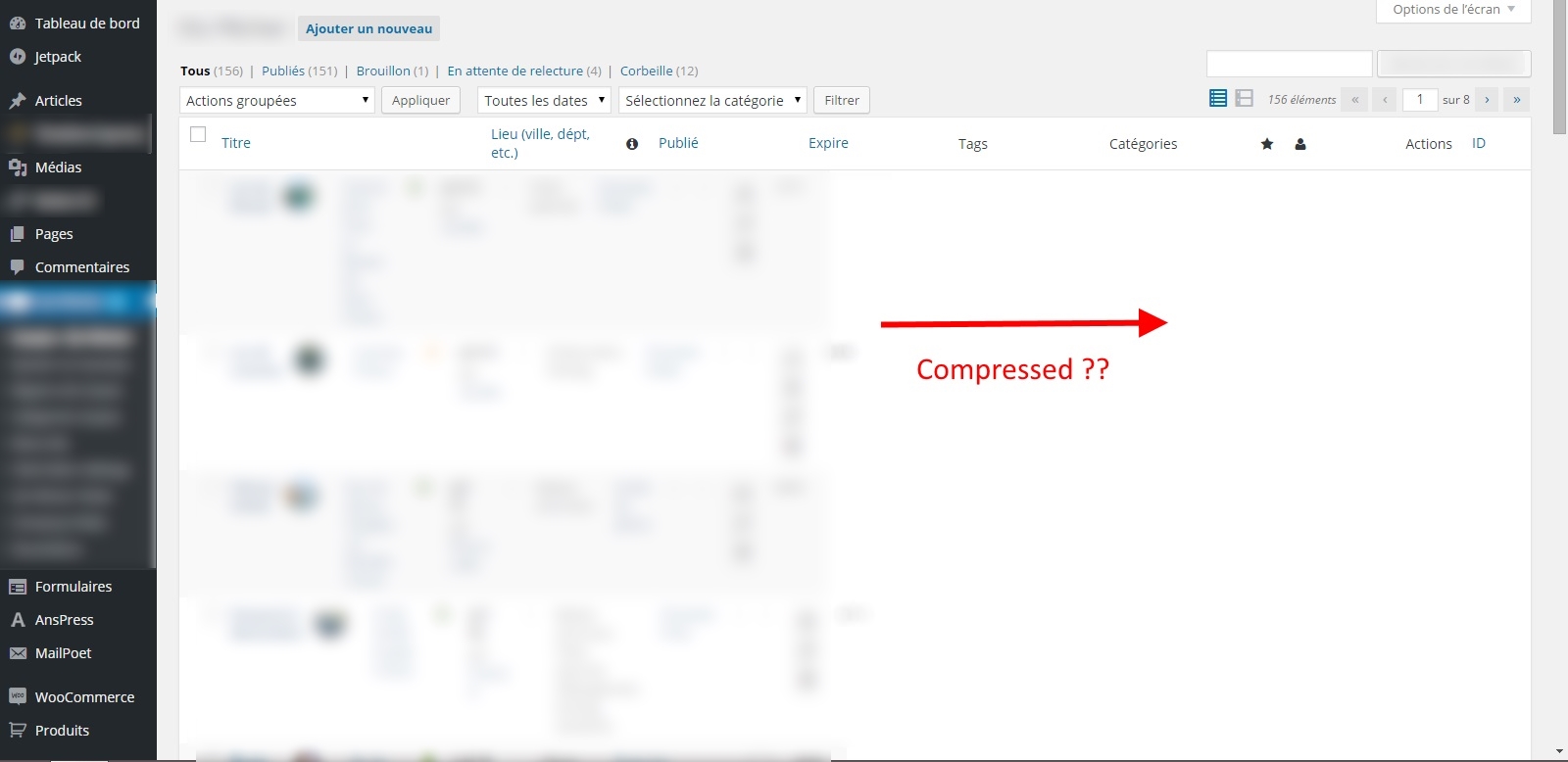
This is simple CSS issue, you can update them in assets/ap-admin.css. Find below CSS and update as per your need. This issue will be fixed soon.
.wp-list-table th#asker,
.wp-list-table th#answerer {
  width: 60px;
}
.wp-list-table th#answers {
  width: 30px;
}
.wp-list-table th#vote {
  width: 60px;
}
.wp-list-table th#status {
  width: 60px;
}
.wp-list-table th#parent_question {
  width: 30%;
}
.wp-list-table th#flag {
  width: 40px;
}
.wp-list-table .type-question .ans-count {
  display: block;
  padding: 2px 0;
  text-align: center;
}
.wp-list-table .vote-count {
  text-align: center;
}
.wp-list-table .type-answer .answerer {
  width: 50px;
}
.wp-list-table th#question_category,
.wp-list-table th#question_tags {
  width: 100px;
}
th.column-question_status {
  width: 50px;
}
td.column-vote_note strong,
td.column-post_title  > a {
  font-size: 14px;
  display: block;
  margin-bottom: .2em;
}
.post_type.column-post_type,
.manage-column.column-post_type {
  width: 70px;
}


Thank you for your support but was’nt the right solution for me.
Here is what I did to fix the problem :
@media (min-width: 768px) {
#anspress .col, .col-sm-1, .col-sm-2, .col-sm-3, .col-sm-4, .col-sm-5, .col-sm-6, .col-sm-7, .col-sm-8, .col-sm-9, .col-sm-10, .col-sm-11, .col-sm-12 {
/* float: left; */
#anspress .col, .col-xs-1, .col-xs-2, .col-xs-3, .col-xs-4, .col-xs-5, .col-xs-6, .col-xs-7, .col-xs-8, .col-xs-9, .col-xs-10, .col-xs-11, .col-xs-12 {
/* float: left; */
I just commented as I will be able to see it for future udpate.
Maybe I’m wrong but it works fine and the responsive is still active in mobile view.
Azman