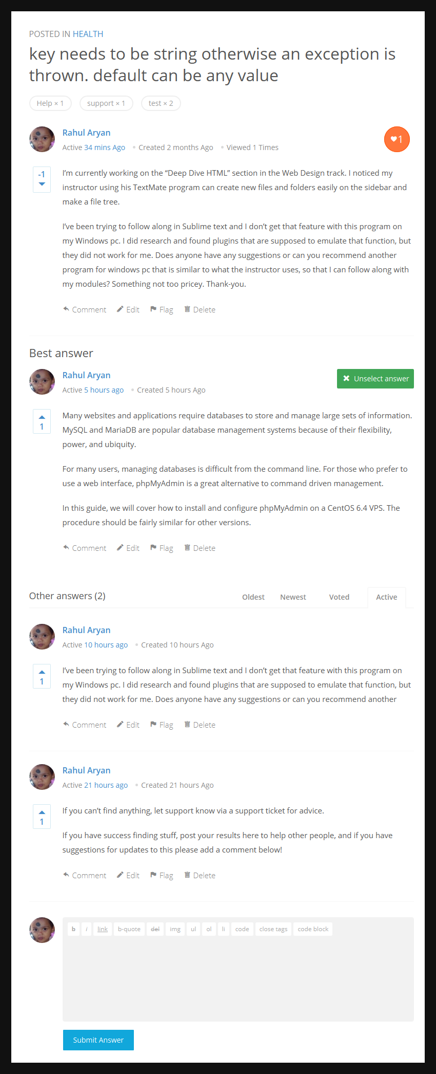
Version 2.0: Question page will look like this
Looks great!
What I really like:
– the “Posted in” + category: it will encourage users to check other questions and let them know where they are if they directly arrive on the question page (simple but really GREAT addition);
– the heart icon and round background encourages user to interact and vote/favorite the question (don’t know which one it is);
– I don’t use tags but if I do one day, they are really well displayed there;
– the separation between “Best Answer” and “other Answers” is much clearer now.
I just can’t wait to try this baby out!!
I’m sure you are. Try to rest a bit too, we can wait. 😀
I completely agree with all of Fred’s points. I think the ‘POSTED IN’ at the top is a great addition. You want users to stay on your site and having that prompts them to click to see more questions in that category. It also emphasizes that the site is organized, with the new ‘categories’ page you can really keep things clean and organized by topics, which is a big improvement.
Heart icon is great to let people favorite question threads and easily come back to them later. Is it possible for users to have it email them when there are updates only to the questions they have favorited? (Sort of like being able to ‘subscribe’ to a question to get notified of replies).


Thanks for the feedback. heart button is favorite button (you can say heart button as follow button, if anyone one who have not participated in question and he favorite the question then he will also receive notification about questions).
Working on user page at the moment, bit overloaded 😐