How do I improve the LogIn and Register landing page?
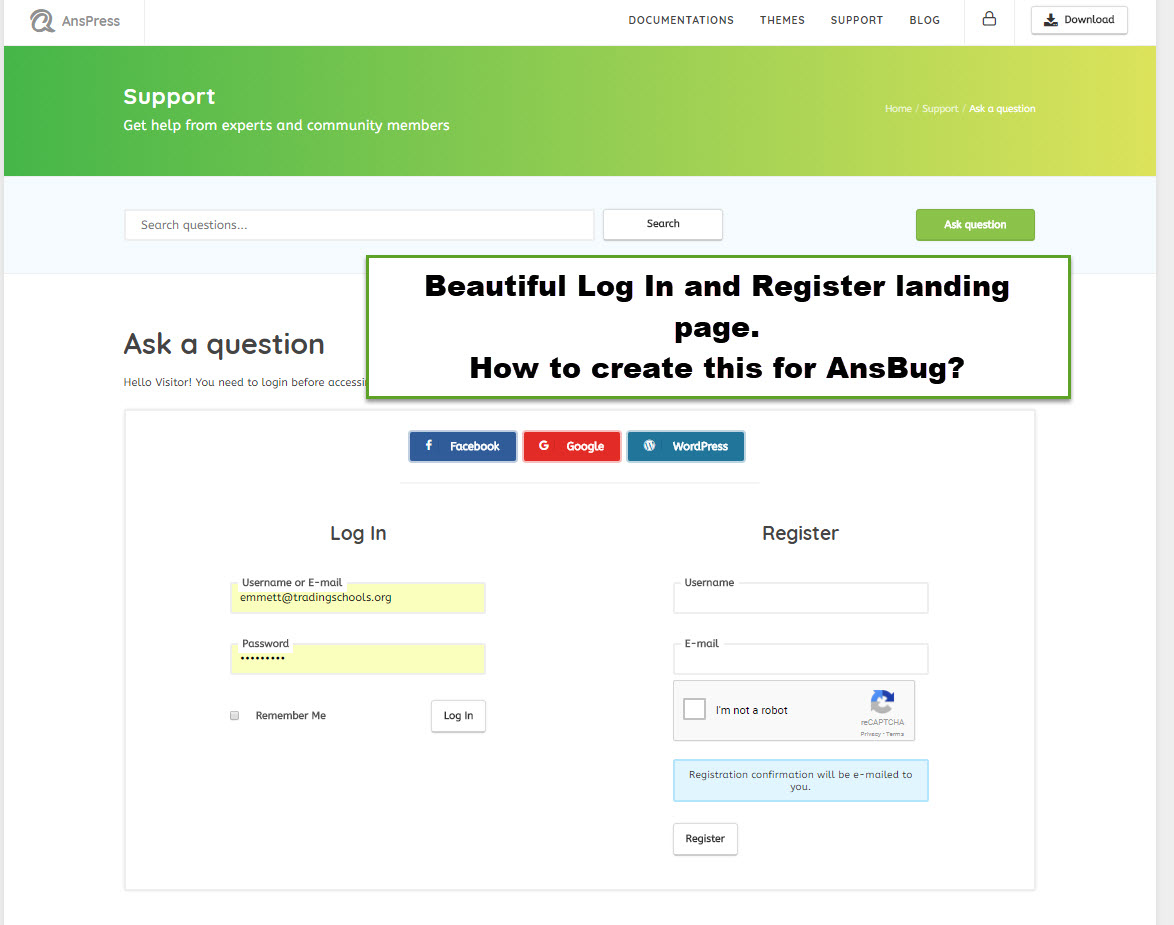
The AnsPress website has a beautiful, well-designed, and user-friendly Register and LogIn landing page. Screenshot below…

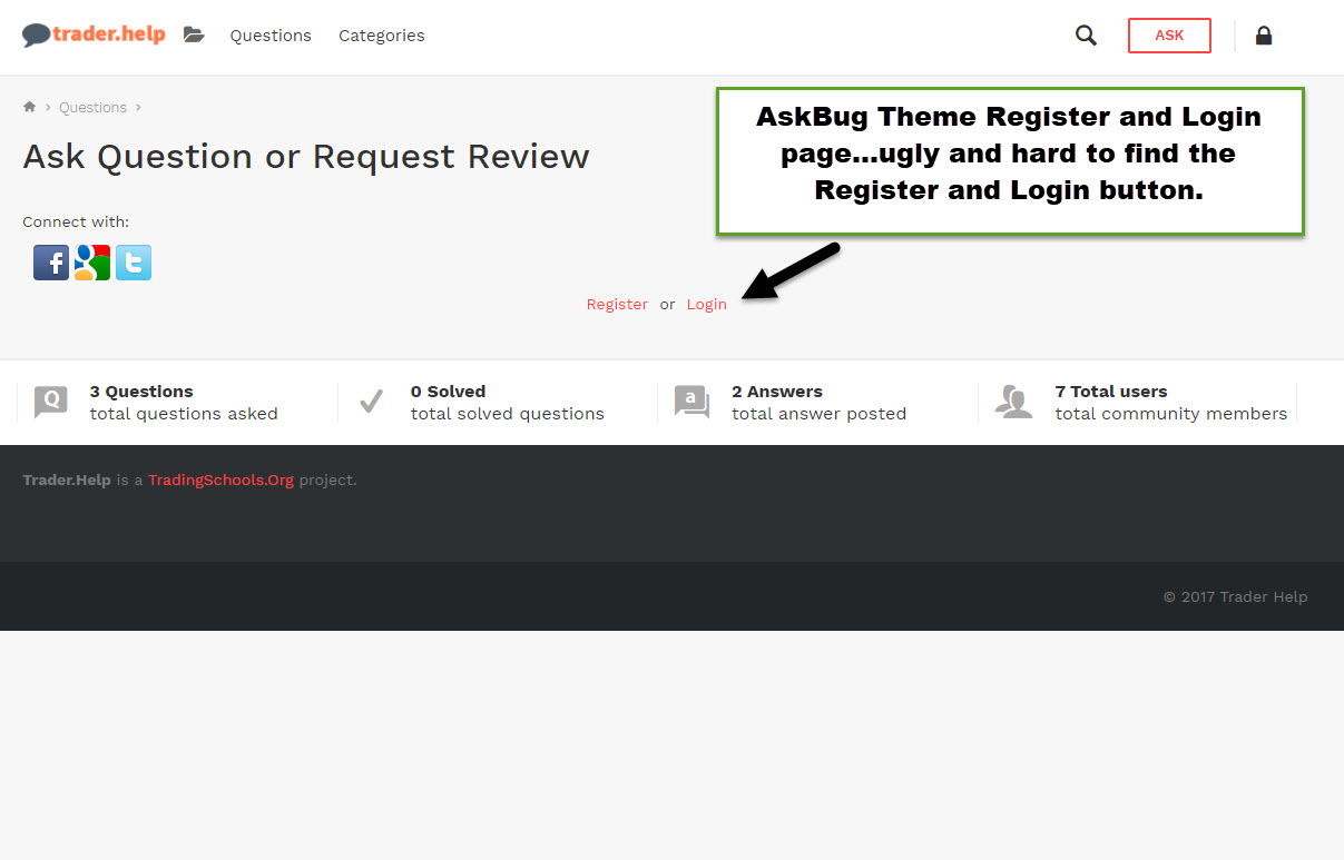
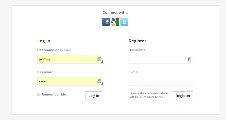
However, the AskBug theme has an ugly, confusing, and hard-to-use LogIn and Register landing page.
Several of my testers have complained that its difficult to find the Register and Login buttons. Screenshot below…

How can AskBug theme purchasers change the Register and LogIn page to match the AnsPress LogIn and Register page?
Thank you, Emmett.
superfly (Buyer) commented
Thank you Kumar.
Looks like I need to add Captcha to the sign up form. In the past day…25 bots have signed up for an account. Yikes. They will spam galore.


Hello,
I am adding a fix for that.