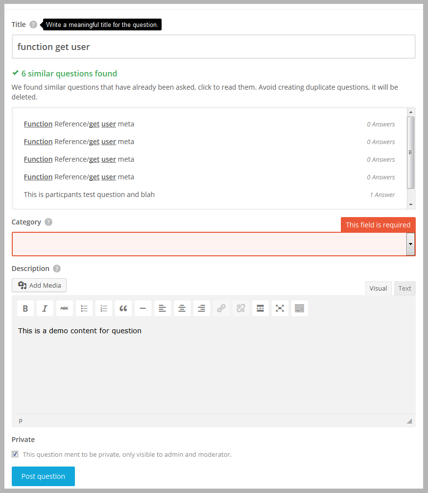
AnsPress 2.0: Ask page with suggestion as design suggested by Chad
Hello folks,
Here is today’s shot of ask page with similar question suggestions.
This new design was suggested by one of our contributor Chad, Do not forget to say him thanks.
Ask page will take one more day, cause Chad suggest a design for category selection and also told me to add icons in category, Its looking nice that way so I am going to implement it too.
And sorry for delay in releasing.

Couple suggestions:
– I would simplify things and get rid of the bold word ‘Private’ and just have the checkbox there on it’s own. That feature doesn’t really need to be given so much attention as it won’t be used often. I would have it as just the checkbox (with text to the right of it) and make sure the checkbox is default unchecked.
– What are your thoughts Rahul on center aligning the Post Question and Update Answer buttons? Looks better on mobile with buttons centered. Or, if you don’t like centered then right aligned, as on mobile people tend to use their right thumb to tap buttons, it’s less of a stretch. Example: Facebook post buttons are always on the right.


— Private checkbox is not checked by default. I think private post feature is one of important feature, cause my clients often need that to disclose their personal info. So I dont think private input need to be minimized. But there is a toggle button in option, if you do not want it simply turn i off 🙂
— I also tried it, indeed it looks better in small screen but will try for big screens, thanks