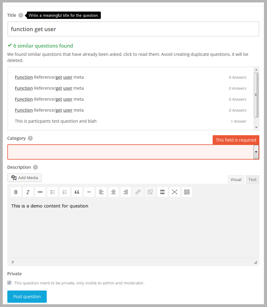
AnsPress 2.0: Ask page with suggestion as design suggested by Chad
Hello folks,
Here is today’s shot of ask page with similar question suggestions.
This new design was suggested by one of our contributor Chad, Do not forget to say him thanks.
Ask page will take one more day, cause Chad suggest a design for category selection and also told me to add icons in category, Its looking nice that way so I am going to implement it too.
And sorry for delay in releasing.

I really liked the labels. I think setting them as an option can make the theme more flexible. Labels like “Topic” can adapt the theme to multiple purposes, like a Reddit site but with a decent design 🙂
Great job Rahul!
Ya, lots of room to expand the plugin and adapt it to many different uses, like using it as more of a forum/discussion board (Reddit style, etc). Extensions will help do that, the AnsPress plugin Rahul has been making it very easy to extend it and let people create their own extensions. Future has lots in store 🙂
I think I will buy all the extensions lol Can’t wait to test it 😀
Defintely starting to look good. Love the similar questions feature integration, will this be an auto complete or display after the user has clicked on a new field?
I agree with Chad that the word private is not really needed. The text next to the checkbox is sufficient.
I would still like to see a couple of features that have been previously discussed.
1. The flow for a user to register/login prior to asking the question. As you mentioned the user will be prompted to login before asking the question in 2.0.
2. Where will the tags field go? In my opinion it should sit next to the category drop down.
The category drop down definitely doesn’t need to be full width since most category options are only 1 or 2 words in length.
1. yes there will be a message to login signup with link and form will be faded. I have removed all login and register forms from AnsPress, from now it will use default WordPress login (or 3rd party login system).
2. As there are too many tasks for tags, I will code tags extension after releasing 2.0 (beta).
I am changing category layout as suggested by Chad.
Couple suggestions:
– I would simplify things and get rid of the bold word ‘Private’ and just have the checkbox there on it’s own. That feature doesn’t really need to be given so much attention as it won’t be used often. I would have it as just the checkbox (with text to the right of it) and make sure the checkbox is default unchecked.
– What are your thoughts Rahul on center aligning the Post Question and Update Answer buttons? Looks better on mobile with buttons centered. Or, if you don’t like centered then right aligned, as on mobile people tend to use their right thumb to tap buttons, it’s less of a stretch. Example: Facebook post buttons are always on the right.
— Private checkbox is not checked by default. I think private post feature is one of important feature, cause my clients often need that to disclose their personal info. So I dont think private input need to be minimized. But there is a toggle button in option, if you do not want it simply turn i off 🙂
— I also tried it, indeed it looks better in small screen but will try for big screens, thanks
Great implementation Rahul! Fantastic job! This feature will help avoid duplicate questions that have already been asked by other users. A common problem with Q&A boards where users don’t check if a question has already been asked 😉
The icons with categories is going to look amazing guys, worth the wait!
also I will code an extension which prevent creating duplicate as per string matching percentage.


Indeed labels are really a cool feature, but not everyone interested in it. So I will distribute it as extension 🙂